Unsteady
When designing the cover for the third issue of Second Red, I started with the synopsis to decide which storyline point would be interesting to develop into an illustration.
‘With only one chance to bring the Strikers to justice, Emi and Brill delve beyond enemy lines. An erratic exchange leaves Dai doubting the stability of the man he chose to follow. Rin uses the confines of captivity to confront his childhood friend.’
While the other plot points lean into describing scenes, the second sentence opens up deeper thematic possibilities.
I’m drawn to ‘doubting the stability of the man he chose to follow’ specifically because I can use this emotional volatility to create a dynamic composition. Whether this is expressed through a literal action, or something more abstract, I’ll explore this during the concept stage.
The man Dai doubts is named Slu. He is the commander of the Strikers; an oppressive gang who rule over the inhabitants of UOKA-2, enlisting labourers to build an escape vessel that will protect them against an impending apocalyptic second-sun.
Dai has been with the Strikers since he was a child. He’s slowly earned Slu’s trust and is now responsible for leading the city’s people to safety when disaster hits. As the temperature rises, so does Dai’s suspicion that Slu’s intentions may not align with his own.
first red
Slu is driven to survive Second Red at all costs. As a teenager, he barely survived First Red; the catastrophic second-sun that sent the world spiralling into disarray during the mid-twentieth century. Deeply scarred by the layers of death he crawled out beneath from, Slu vows to outlast the second-sun should it ever reappear.
He creates the Strikers; his own personal army. In the wake of devastation, early joiners are drawn to Slu’s vision of survival. As a makeshift city emerges from the ashes under his direction, he stands as the unelected leader of UOKA-2. Soon enough, the person who first appeared to be a guiding hand for survivors more closely resembles a vice grip.
Using Slu’s desire to never again face the horrors of the second-sun, I’ll explore compositions that investigate his desperate nature.
Start small, messy and… completely unreadable?
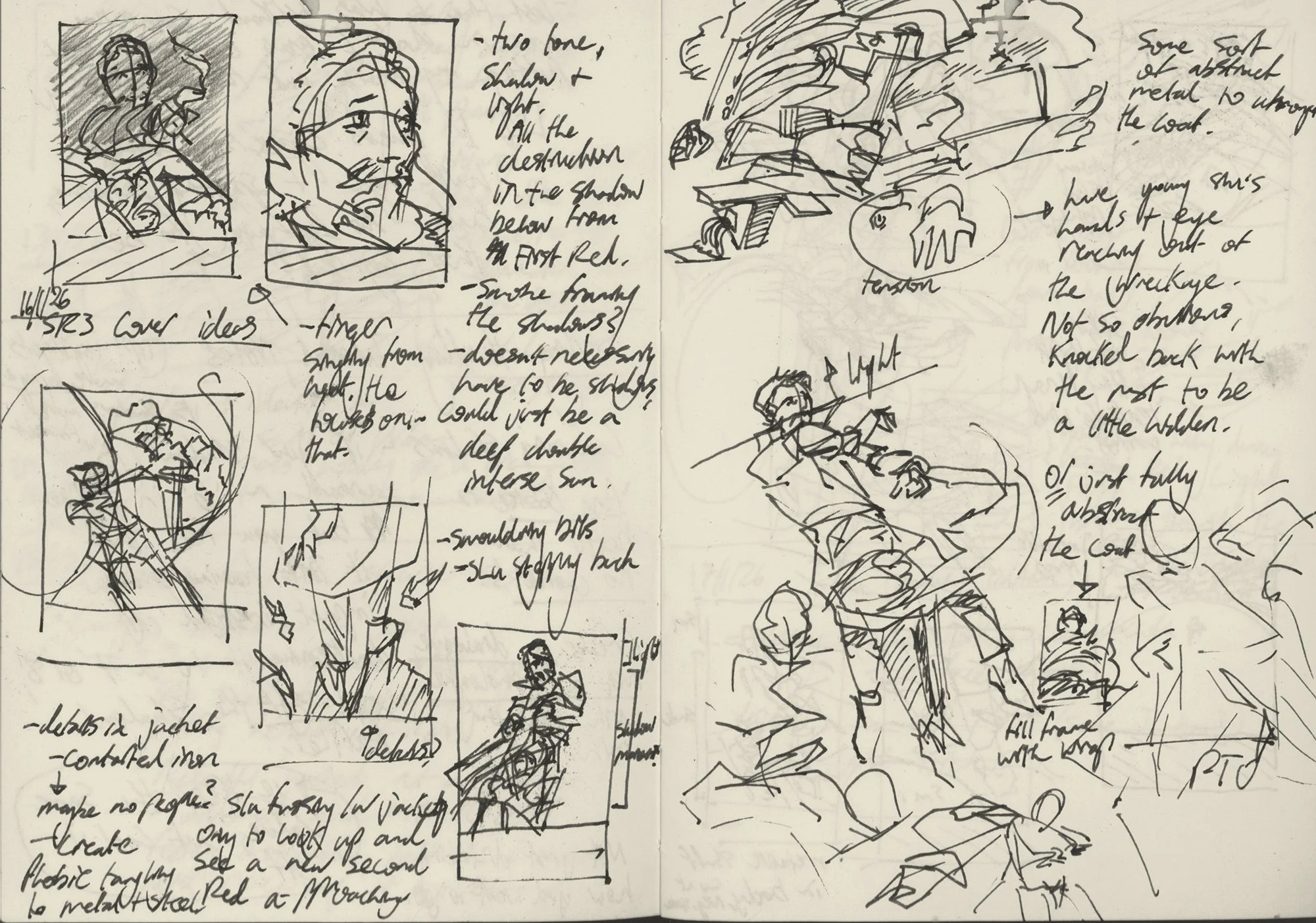
On the above thumbnail page I rough out dividing elements such as shadows and smoke to create a tension between Slu and the trauma of his past surviving First Red. In the upper left, he stands in the shadows out of harms way. He extends a finger and watches smoke singe from the end. The chaos he’d rather forget plays out beneath him.
Slu wears a long coat and I’m interested in placing figures and motifs from his past (or a possible future?) inside it’s silhouette. I can use colour and light to make his expression a focal point and knock back the montage outlined by his jacket, creating a secondary point of interest.
I love drawing masses of industrial shapes. The idea of overwhelming heat contorting buildings, power-poles and the like into swirling graphic shapes contribute to Slu’s backstory. These shapes can emphasis the caustrophobia he feels – never wanting to be trapped by the second-sun again, but needing to burrow deep down below the surface to escape it.

The composition to the bottom left of the above page uses scale to create a sense of loneliness and inevitability. Two suns are merging and the shadow in-between is receding. I come back to the idea of contrasting busy detail against graphic shapes – industrial elements skew and merge before Slu as he witnesses the horrors of his past cleared away by a repeat disaster.
Slu only survived First Red due to the help of his now second-in-command; Nil. Both teenagers at the time, she drags his near-lifeless body into a basement crowded with countless others taking shelter from the unbearable heat. The odour of impossible proximity isn’t enough to force anyone to budge. Days pass. The sound of breathing hastens, drys, then cuts out completely. If anyone else is still alive, they’re too afraid to step foot outside to confront what remains.
On the right side of the above spread, I imagine the moment Slu makes his way back to the surface from the basement. Surrounded by death below and above, he’ll suffocate if he stays put. Whatever the world has become in the wake of the second-sun, he chooses to face it.

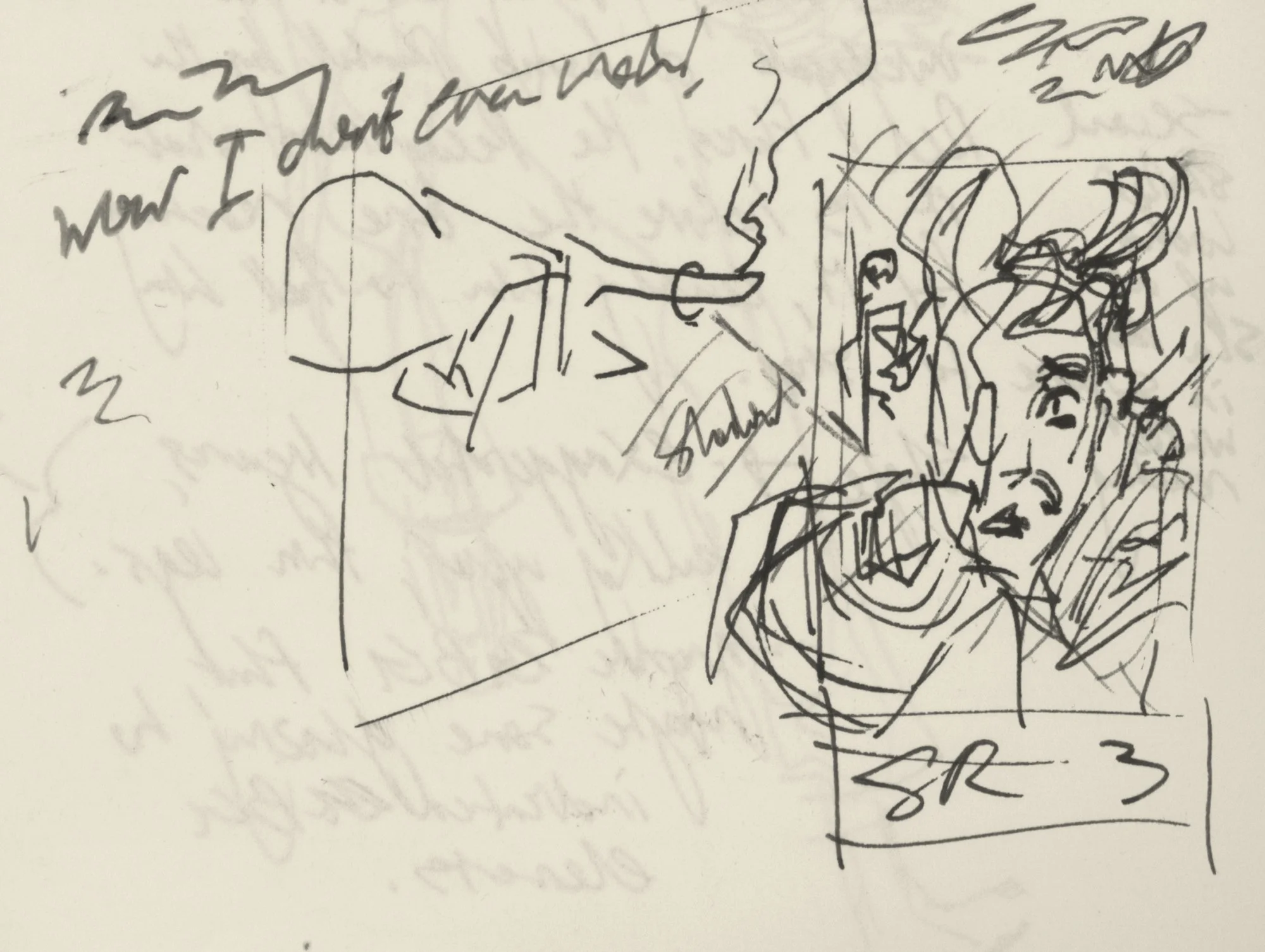
I refine the idea of an earlier thumbnail by including the two suns as graphic elements. Finally, I take the pose of Slu inspecting his outstretched finger and create a close-up front-facing layout. From this angle I can really dial up the intensity of his expression.
some kind of sense
I’ve got a good sense of the moment and mood I want to create for the cover, so I choose a few of the strongest compositions to develop further. I have a graphic template that I use for each issue, so type elements are already set.

Concept One

Concept Two

Concept 3
For concept one, I wanted to play with dynamic feet and hand placement and forego any facial expressions to create tension.
Slu is surrounded by desperate hands. These hands could be read as the claustrophobia he felt during the days in the basement hiding from First Red, or the pressure he feels from UOKA-2’s current inhabitants to provide them with a means to escape Second Red.
I like the relationship between past and present tension, but am curious about whether this composition creates enough of a connection between the story and the reader.
Concept two isolates Slu and places him in a revelaing pose. He’s drawn at his current age (around late-forties.) Here I want to take the idea of emerging from the basement, simplify the moment right down to the light breaking through the cracks of the wall that separates him from whatever awaits outside. Simplifying this scene from his past into a graphic element allows me to show that it still weighs heavily on him in the present.
His finger singes as it reaches forward. I could use colour to create depth to bring focus to either his hand or face.
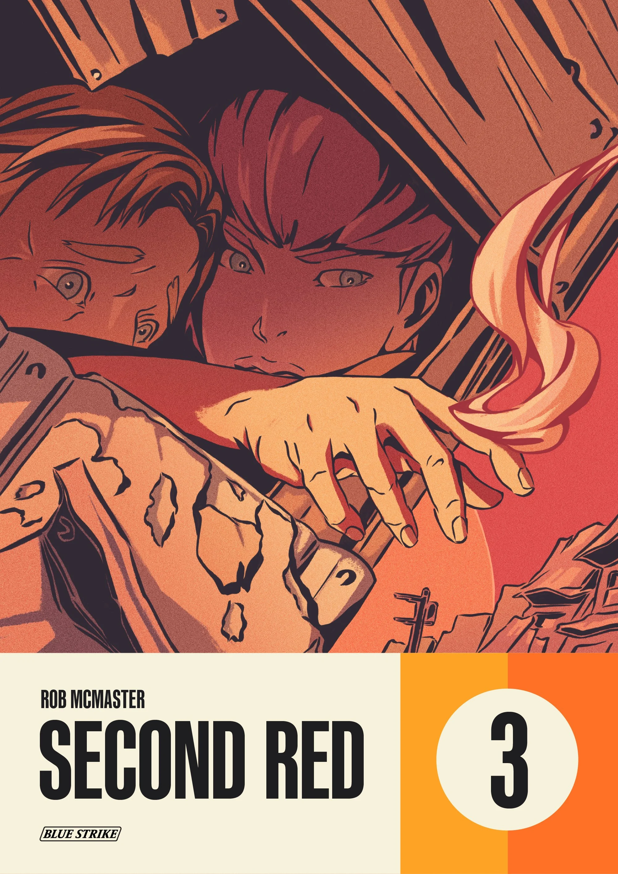
I’ve explored the ‘singeing finger’ in a few different compositions during the earlier roughs and it’s emerged as my favourite idea. For concept three, I take the pose from concept two and place it in a new context on a dynamic angle. I also introduce Nil into the composition. She is an integral part of Slu surviving First Red and has been influenced in her own way by it’s horrors. Both Slu and his future second-in-command peak out towards the unknown. Without realising it then, both survivors are now resolved to wrangle the merciless power of disaster to control their future.
This moment is pivotal for both characters in that they’re uncertain about their future, but compelled to act in ways that people born after First Red could never understand. By providing more context compared to the previous concept, I can introduce a second light source that tells more of the story to illustrate an interesting cover. I decide to move forward with concept three.
Touch the Second-sun

Step One – Rough

Step Two – Layout
I want to tighten down the expression of Slu and Nil in step one. I use the relationship between Slu’s outstretched hand and each of their eyes to create curiosity and tension. This confined composition brings focus the characters, but I can still add depth to the scene by adding the receding street in the background. Building features are worn and skewed to reveal the context of disaster.
Once I’m satisfied with the basic design, I move on to step two. Here I’ll investigate how to use light to control the focal points of the scene. I want the viewer to first focus on Slu’s hand being singed by the fading second-sun, then to him and Nil huddled in the shadows.
The contrast between light and dark creates an area of interest between the two focal points. I don’t want the figures to get lost in the shadows. It’s important that they feel like they’re on the verge of stepping outside. I add a weaker light source, perhaps coming from a crack in the other side of the building, to give Slu and Nil greater dimension to their faces. Finally, the light reflected in their eyes from the smouldering hand guides us between the two focal points.

Step Three – Inks

Step Four – Flats
Once I have the layout finalised, I move on to step three. I print the layout, then transfer it to A3 bristol board using a light box and pencil. From here I ink the line-work using a Raphael Kolinsky Sable 1 brush and Kuretake Sumi Ink 60. I use Copic Opaque White to correct mistakes and Pigma Micon pens for tighter control on details. When I’m finished, I scan the inks and clean them up in Photoshop.
Before choosing which colours to use, I flat out the design. For my purposes, step four solves two problems. Firstly, you can decide on your colour layout. This allows you to develop relationships between colours before choosing them. Secondly, by flatting colour shapes using selection tools (be sure to turn anti-aliasing off!) you can rapidly concept colour palette ideas. This means you can focus solely on choosing colour once flatting is complete, without trying to design colour at the same time.

Step Five – Colour Block

Step Six – Final
The cover design elements for each issue of Second Red have a unique colour scheme. I’ll use this to direct the palette choices in step five. The oranges in the design elements are warm. The scene I’m illustrating is also warm. Even though there is potential to overpower the cover with warm colours, I use subtle temperature shifts in the shadows to cool it off and help keep the composition balanced. I want contrast, but not so much that the colours fall out of harmony. I block out the shadows and highlights using a textured brush. I think this contrasts nicely against smooth inks.
In step six, I work in simple gradients to add more dimension and focus. I overlay different colours on the line-work – darker in the foreground and lighter in the background to further push the illusion of depth. I add more contrast to the figure’s faces by cooling off their irises and adding tiny reflections in their pupils. Now they ‘pop’ better from the shadows without competing against from my main focal point. I tweak the colours using the Hue/Saturation function to get everything just right. Finally, I add noise to give the illustration a unified, analogue feel.
SECOND RED THREE
With only one chance to bring the Strikers to justice, Emi and Brill delve beyond enemy lines.
An erratic exchange leaves Dai doubting the stability of the man he chose to follow.
Rin uses the confines of captivity to confront his childhood friend.